MW Counseling
A website review written from the position of someone anxious about booking their first therapy session.
Capabilities used
- Creative Design & Content Production
An Unsolicited Review
Nobody asked us to look at this website. We wrote the review on our own initiative and sent it, which makes it a proposal rather than a report, and it shows in what we had to work with: no analytics, no intake numbers, no access to anything inside the practice. That constraint shapes the document: it can only argue from what is on the page, so every recommendation has to stand on reasoning a reader can check for themselves.
The Anxious Visitor
The review takes one position and holds it for twelve pages. Somebody landing here may be nervous, unsure whether their problem counts as bad enough, and half looking for a reason to close the tab.
That is a harder reader than a comparison shopper, and it changes the question. Not whether the information is on the page, but whether a person in that state can act on it.
Three Equal Buttons
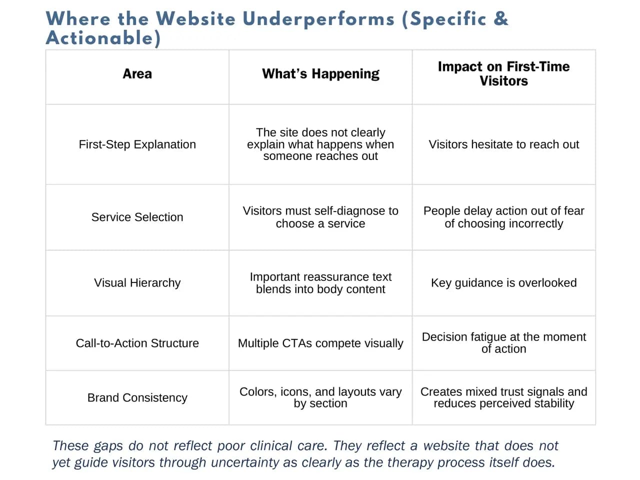
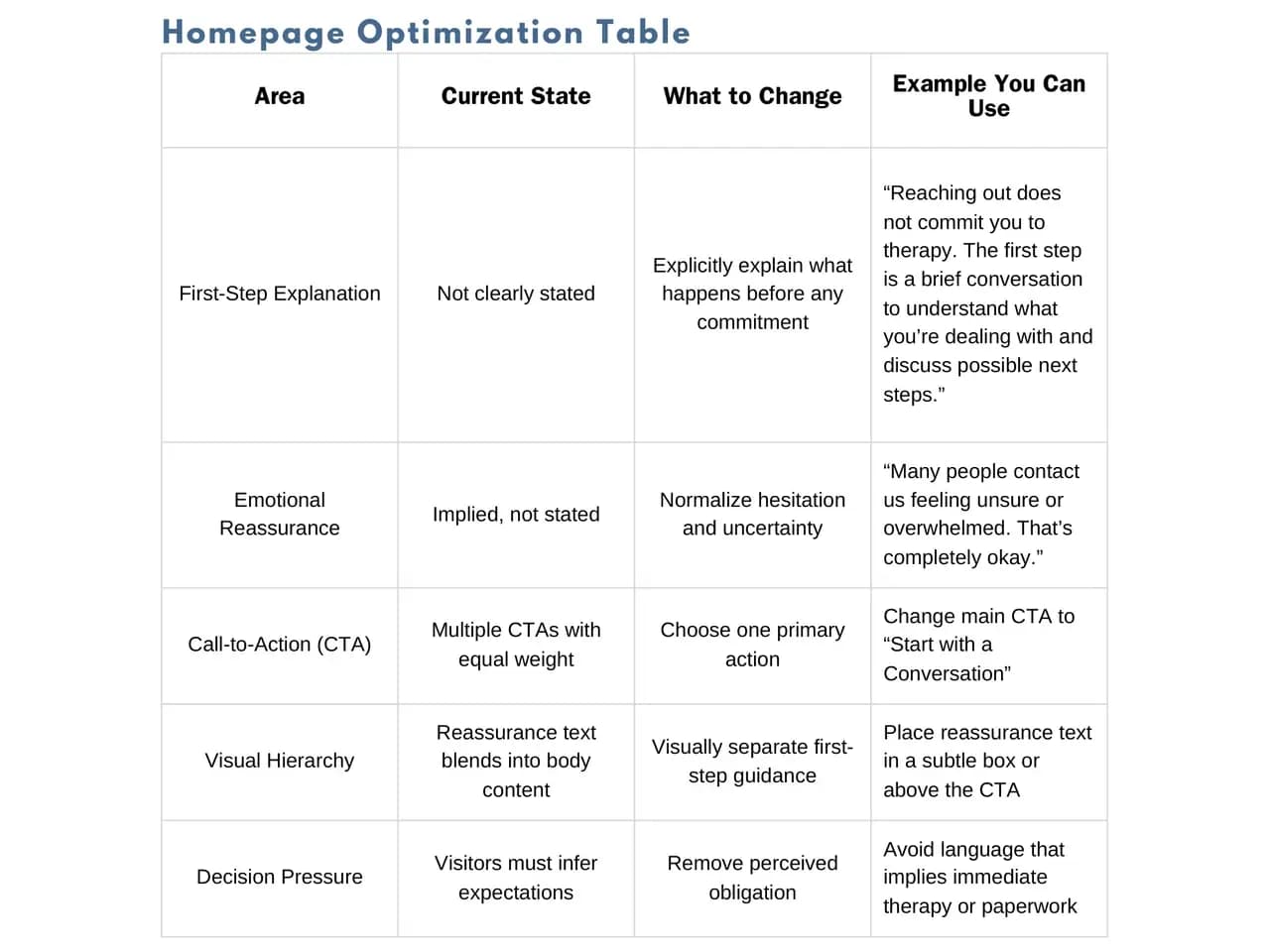
The contact area offers Schedule Session, Inquiry Form and Email Me, all weighted the same. Three equal options is not more choice. It is one more decision, taken at the moment somebody is least able to take it.
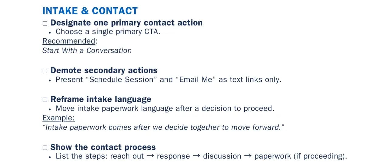
We recommended a single primary action with the other two demoted to plain text links underneath. All three are still there, still equal.
The Self-Diagnosis Problem
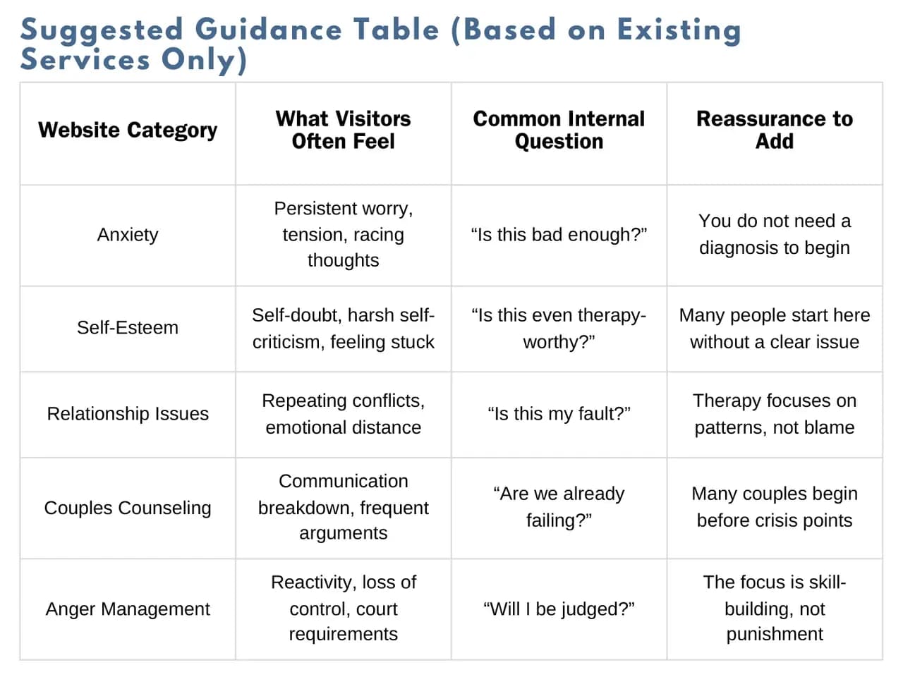
Services were listed as conditions. To pick one you first have to settle what is wrong with you, which is a lot to ask of somebody who came to the site precisely because they are not sure.
We mapped every category the practice already offers to the question a person is actually asking themselves about it, and wrote one line of reassurance for each. Nothing new was invented and no service was added.
The Missing Sentences
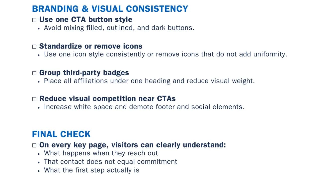
The site never says what happens after you get in touch, or that getting in touch commits you to nothing at all. That gap is the whole review, so we wrote the sentence instead of describing it.
“Reaching out does not commit you to therapy. The first step is a brief conversation to understand what you’re dealing with and discuss possible next steps.” And one for the hesitation underneath that: “Many people contact us feeling unsure or overwhelmed. That’s completely okay.”
One Icon Style
Icon styles, button treatments and third party badges change from one section to the next. On a practice built around being calm and steady, a page that looks unsettled works against the thing being sold.
The fixes are small and dull, which is the point. One button style, one icon set or none, affiliations gathered under a single heading rather than scattered near the calls to action.
The Contact Mockup
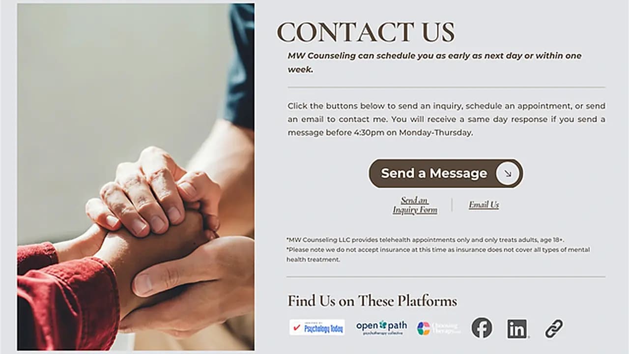
The picture at the top of this page is ours, not theirs. It is a mockup we drew of what their contact section could look like with one primary button, the reassurance said out loud, and the affiliation badges collected into one row.
It is not a capture of their website and never was. Their contact page still looks the way the review describes it.
Sent, Never Answered
We sent it. Nothing came back, no work followed, and none of it was acted on.
It sits here because the thinking holds up on its own, not because it turned into an engagement.
Keep exploring
Next project: ArtistWant something like this for your business?
Tell us what you're trying to grow, and we'll reply with a straight answer on whether and how we can help.