An artist's website built end to end, for a practice we made up so there was something real to design.
Capabilities used
- Creative Design & Content Production
- Web Development & Marketing Funnels
An Invented Practice
Maren Soleil does not exist: we invented a working artist so the design had a real subject rather than a placeholder. Designing for an artist means designing for a whole career, not a portfolio: the work, where it has been shown, where it can be bought, who stocks it. Inventing one gave us all of that to lay out at once.
Type Left, Painting Right
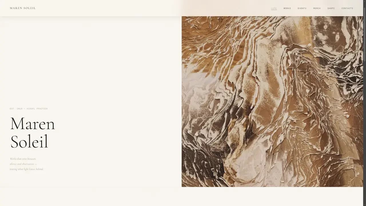
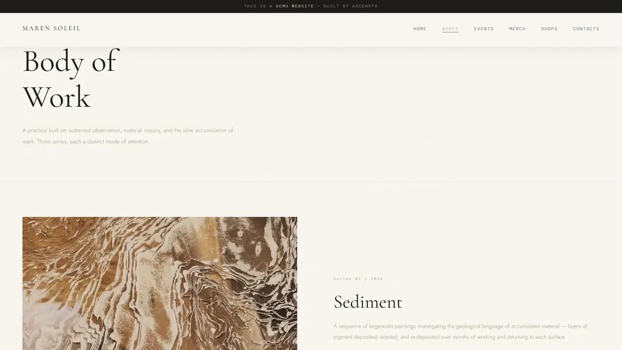
The home page sets type on the left and lets a painting fill the right half to the edge of the frame. Interior pages keep the same pairing and swap the sides, so the work is never reduced to a thumbnail.
The split is doing the arguing. On an artist's site the work has to be the largest thing on screen, ahead of the navigation, the statement and the name.
A Career, Not a Grid
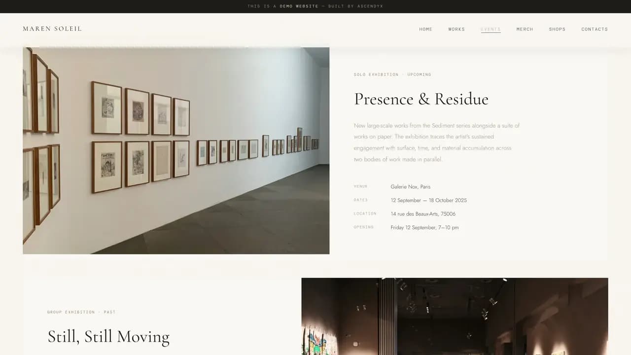
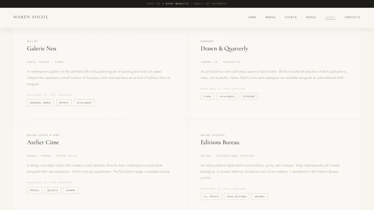
The site carries five content pages rather than one gallery: the work in series, the exhibitions and residencies, the editions for sale, the places that stock them, and the ways to get in touch.
That is the actual demonstration. A practice needs somewhere to put a show with a venue and a date, and somewhere to put the shop, and a portfolio template with a grid and an about page has nowhere for either.
One Document
All six pages live in one document and are switched in the browser, so moving from the work to the shop never flashes a white screen in between. On a site where every page opens on a picture, a reload is the thing most likely to break it.
It is static HTML, CSS and JavaScript with no framework and no build step. One document, one stylesheet, one script.
The Editions Shop
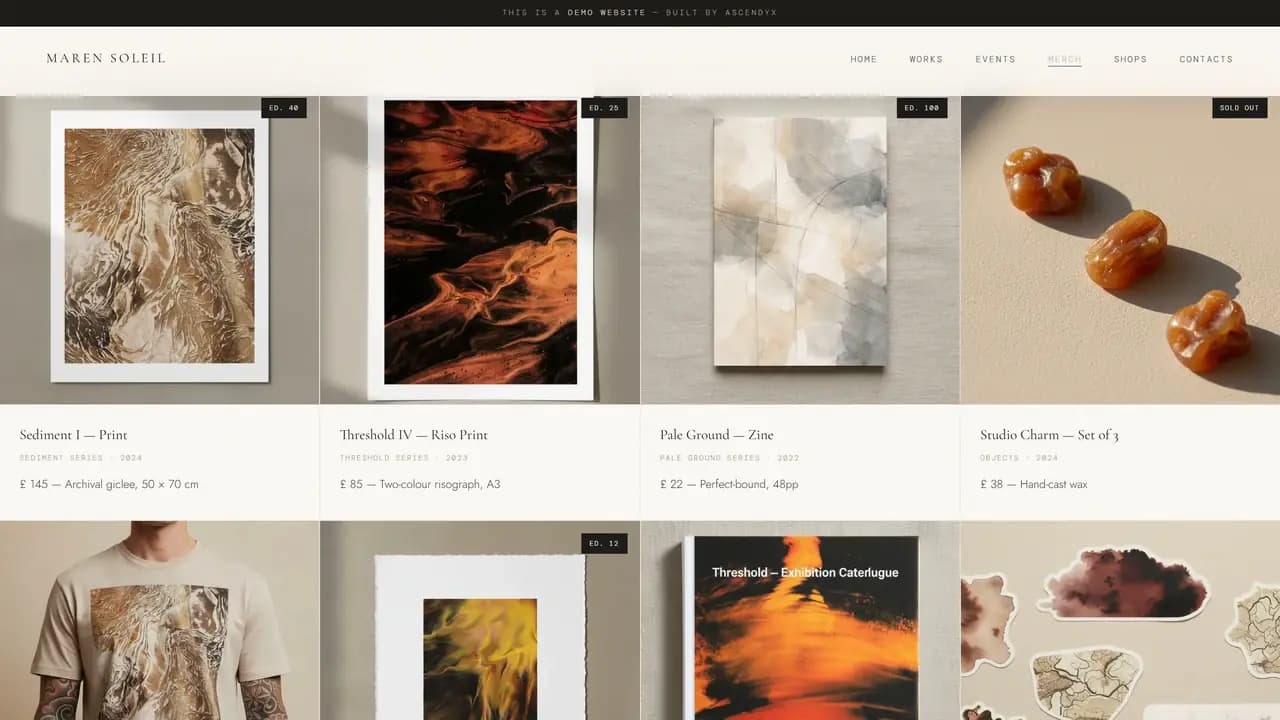
The shop is laid out as a real shop, filtered by kind, with a price and an edition size against every item and one of them marked sold out.
Scarcity is most of how editions are sold, so the number in the corner of a card is not decoration. Leaving it off would have made the page a catalogue of pictures instead of somewhere to buy something.
The Paintings
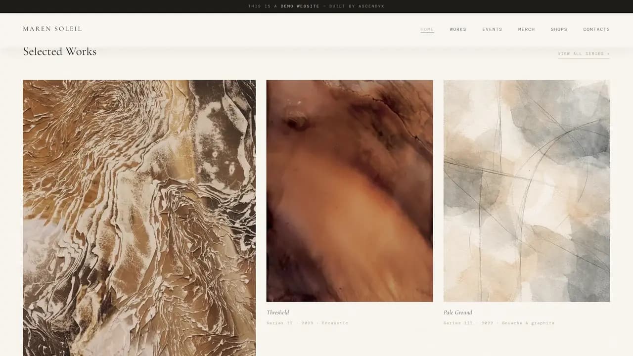
The paintings were sourced. What we made is everything around them: the name, the typography, the writing, the layout, and the way the six pages fit together.
Worth saying plainly, because they are the most impressive thing on the screen and the credit for them is not ours.
Ready to Be Moved Into
The reason for building it this far is that nothing in it is a placeholder. Every page is finished, so a real artist could put in their own name, their own work and their own dates and have a running site rather than a starting point.
That is the difference between a template and a demonstration. One shows you a layout and the other shows you the whole thing working.
Keep exploring
Next project: Date Love LustWant something like this for your business?
Tell us what you're trying to grow, and we'll reply with a straight answer on whether and how we can help.