A photography portfolio concept where the point of view arrives before the first picture.
Capabilities used
- Brand Strategy & Identity
- Creative Design & Content Production
- Web Development & Marketing Funnels
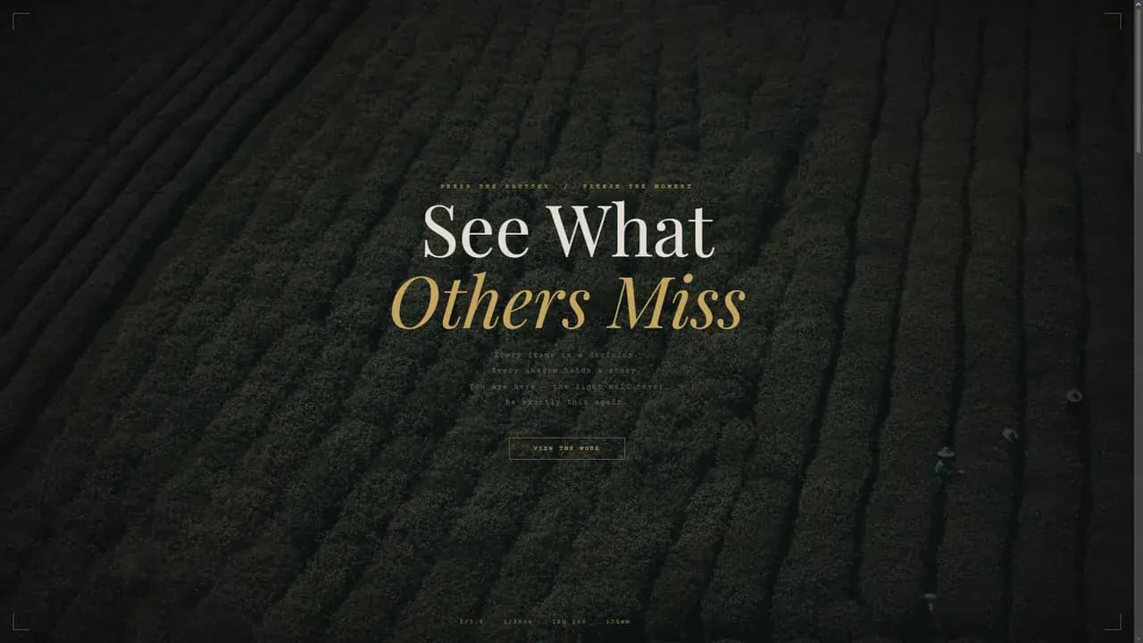
The Premise
Frame is a portfolio for a photographer who does not exist. No studio stands behind it and no client asked for it, which means every decision on the page is a design decision rather than a compromise. The question it is testing is whether atmosphere can be established before the work, and the whole build is arranged around answering that.
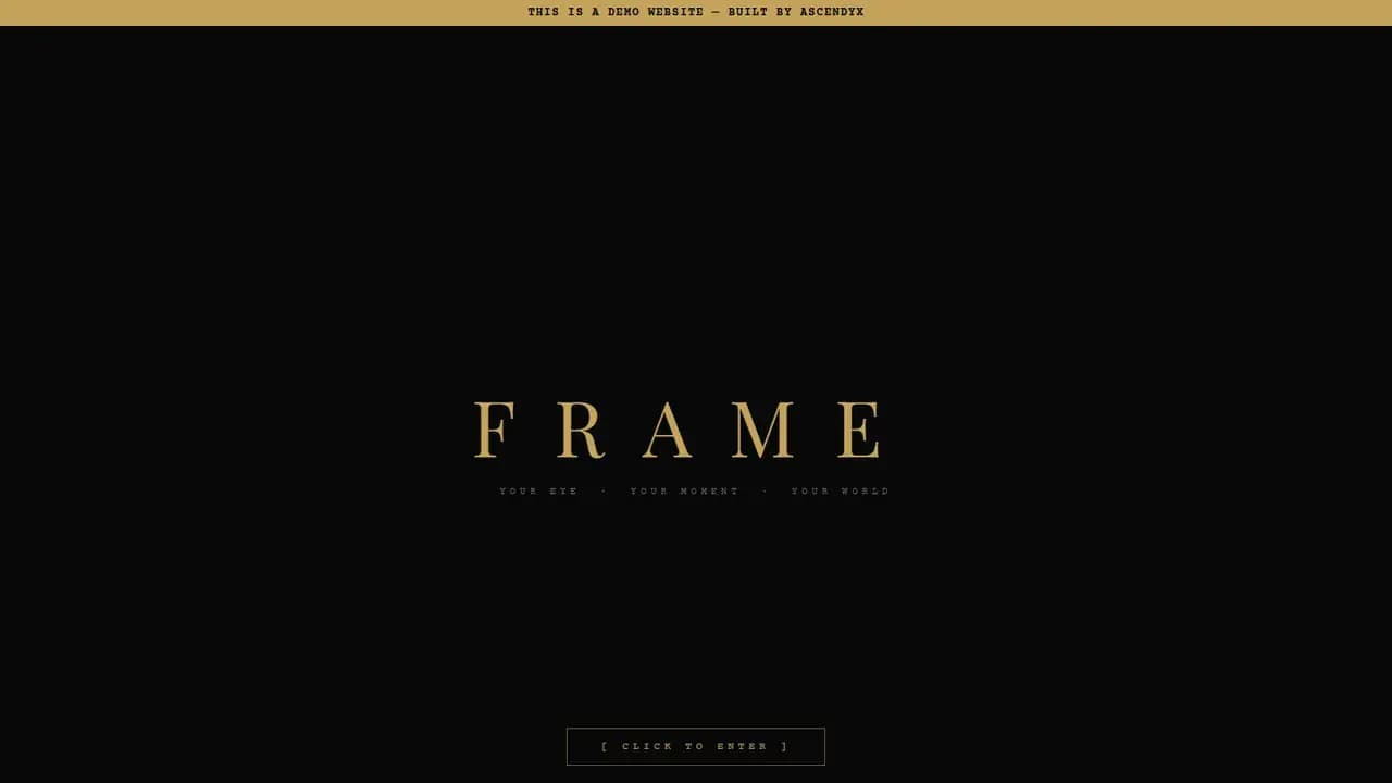
The Entry Gate
The site does not begin on its own. A dark screen holds the name and one control, and until that control is pressed there is nothing else to look at.
That costs a visitor a moment and buys the first photograph a clean arrival. It is also the one place where the site behaves like a camera instead of just looking like one.
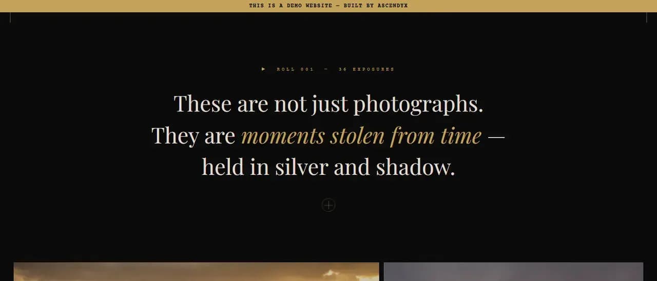
The Camera Readout
Above the first picture the page prints an aperture, a shutter speed, a sensitivity and a focal length, and labels the whole site as one roll of film with a set number of exposures.
The readings are set as a decoration rather than as data, in mono type at a size you read second. What they buy is register: you know what kind of site this is before a single photograph loads.
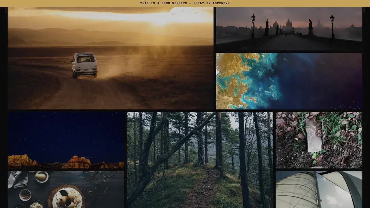
An Uneven Grid
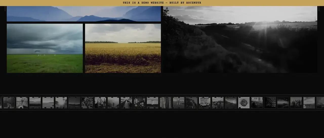
The gallery is not a uniform grid. Images run at different widths and heights and the rhythm keeps changing on the way down, so no two arrive the same way.
Equal tiles read as a catalogue. Sizing each picture on its own is the cheapest way for a portfolio to say that some of them carry more than others.
The Lightbox
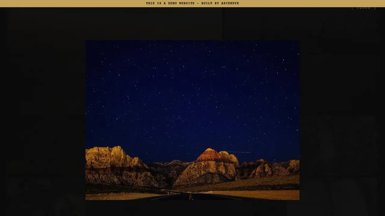
Any photograph opens over the page at full size with the rest of the site dropped behind it, then closes and puts the visitor back where they were in the grid.
The Contact Sheet
A strip of small monochrome frames runs under the gallery, sprocket holes and all, the way a developed roll gets proofed before a single print is made.
The strip is pure decoration. It earns its place by implying a longer roll that somebody sat down and edited.
Placeholder Imagery
Every picture in the gallery is pulled live from a placeholder service, so none of it is ours and none of it was taken for this. The demo is a frame for photographs rather than a set of them.
That is the interesting constraint, in fact. A layout that only works with photographs you chose is not a layout, and this one had to hold whatever arrived at whatever aspect it arrived in.
One File
There is no framework here and no build step. Frame is a single HTML document with its styles and its script written inside it, pulling Playfair Display and Courier Prime from Google Fonts, and nothing else of ours loads at all.
That belongs at the end rather than the front, because the gate, the readout, the gallery and the contact sheet are all decisions about attention, and none of them needed a stack behind it.
Keep exploring
Next project: FragranceWant something like this for your business?
Tell us what you're trying to grow, and we'll reply with a straight answer on whether and how we can help.