A fragrance demo where the product was modelled and rendered before a line of the page was written.
Capabilities used
- Brand Strategy & Identity
- Creative Design & Content Production
- Web Development & Marketing Funnels
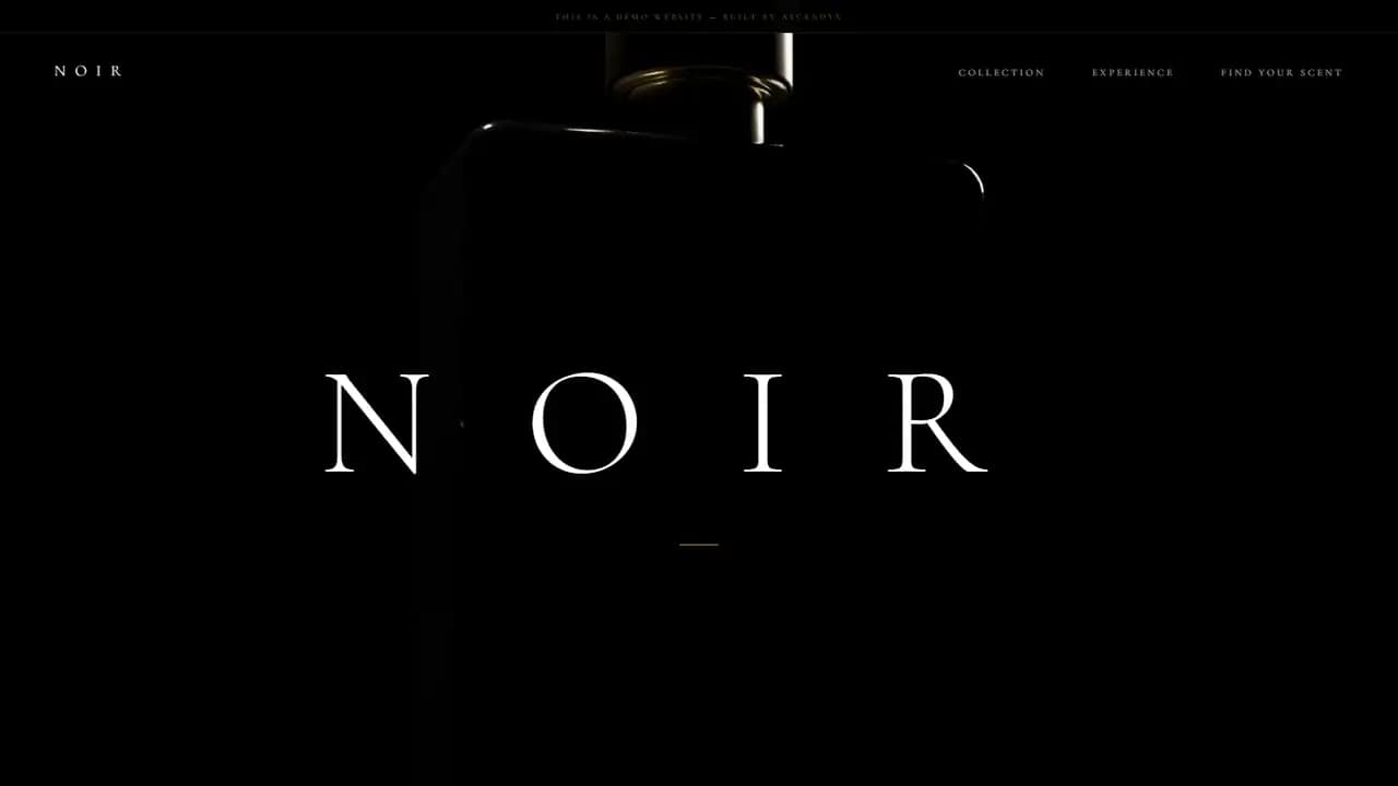
An Invented House
NOIR is a fragrance house we invented, so the design had a product behind it. Starting from the object rather than the page is the decision everything else follows from. Once the flacon existed as geometry we could turn it, relight it and recolour it at will, and the layout could be built around what the bottle was already doing.
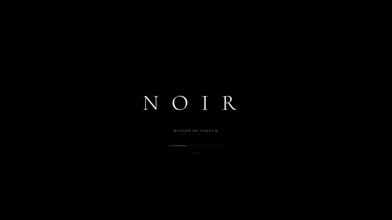
The Full Preload
The site holds a black screen carrying the brand name and a counter while it pulls down every frame of the animation, and shows nothing else until the last one lands.
That costs a visitor real time before they have seen anything. A sequence somebody scrolls through has no graceful way to skip a frame that has not arrived, so waiting for all of them beat letting the bottle stutter.
Modelled in Blender
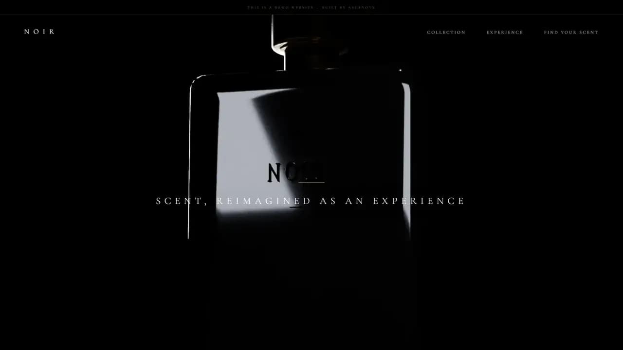
Nothing here was photographed. We built the flacon in Blender, gave it its glass and its gold, cut the mark into its face, lit it and rendered the whole turn out one frame at a time.
The page plays that back by hand. A canvas draws a single frame, the scroll position decides which one, and the type arrives over the top at points set against the animation rather than against the page.
Three Scents, One Model
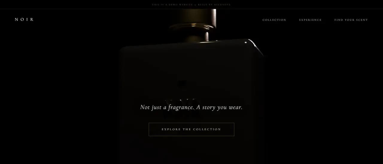
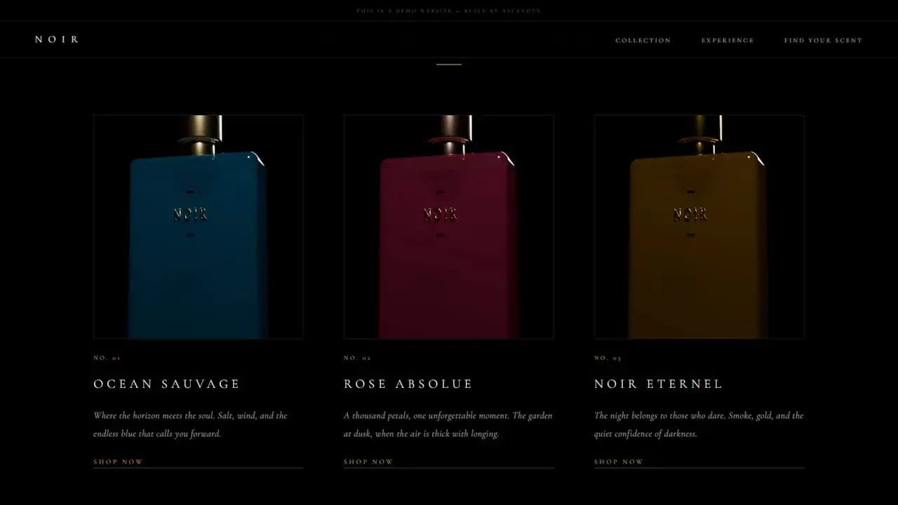
The collection is three fragrances, and all three are the same object rendered again in another colour. The blue, the red and the gold share one model, one camera and one lighting setup.
Built that way a range costs very little after the first render and it holds together on a shelf, which is close to how a house with one flacon and several fragrances actually works.
A Screen for One Line
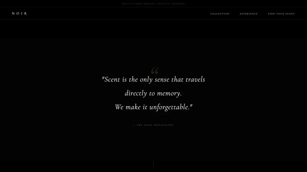
Between the collection and the finder the page gives a full screen to a single pull quote about scent and memory, credited to the brand itself rather than to any person.
Giving a screen to one sentence buys a pause between two busy sections, and it is the only place on the site where the brand talks about itself rather than about a product.
The Scent Finder
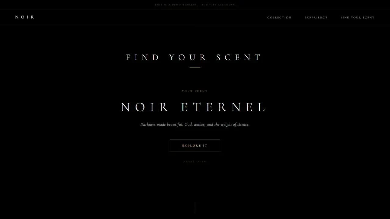
The finder asks what mood you want to wear and when you reach for fragrance, then names one of the three and offers to take you to it.
A shop this small has nothing to filter. Two questions read as somebody serving you rather than as a control panel, which is the closest a page like this gets to being handed a paper strip across a counter.
Where the Weight Sits
Weigh the two halves and the page is the smaller one by a long way. The document carries its own styles and its own script, asks Google Fonts for Cormorant Garamond, and that is the end of it. No framework and no build step.
Everything else is renders, sitting in a folder the page has to pull down in full before it will show a thing. The part we wrote is the cheap part, and the part we made is what a visitor actually waits for.
Presentation, Not Commerce
There is no cart, no checkout and no form anywhere on the page. The demo is about a product and the way it is presented, so everything that would turn it into a shop was left out on purpose.
That restraint is what keeps the render in charge. Nothing competes with the bottle for the visitor's attention, and the page ends where the object does.
Keep exploring
Next project: Beauty & WellnessWant something like this for your business?
Tell us what you're trying to grow, and we'll reply with a straight answer on whether and how we can help.