A launch site for a software product we invented, because a demo needs something real to sell.
Capabilities used
- Brand Strategy & Identity
- Web Development & Marketing Funnels
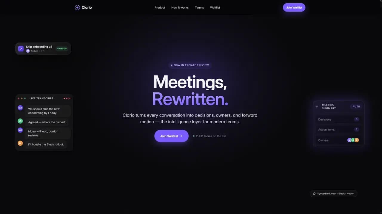
An Invented Product
Nothing here was pitched to anybody. The premise exists so the brief is ours end to end, which is the interesting version: no client narrowing the field, and nowhere to hide behind somebody else's requirements.
The Opening Argument
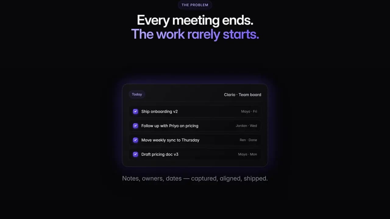
The site opens on the argument rather than on the product. Scribbled notes and half questions drift across the screen, the kind left behind after a call, and then they settle into one clean board with an owner and a day against every line.
That single move is the pitch. A visitor who reads nothing else has already been shown the before and the after.
Six Named Modules
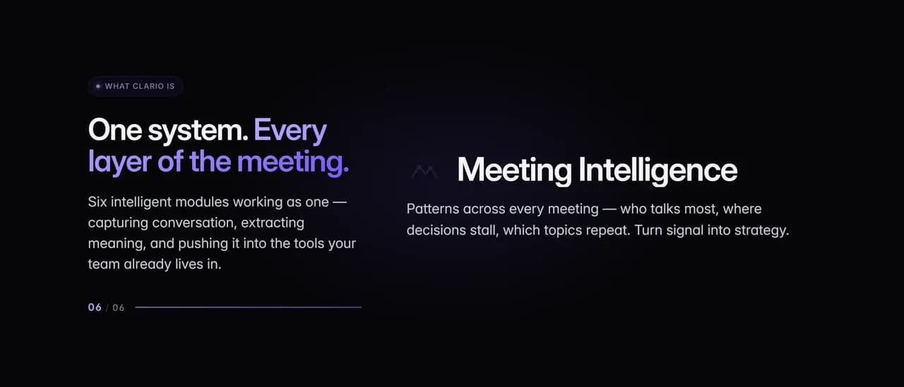
Instead of a feature list, the middle of the page steps through six named modules one at a time, with a counter showing where you are in the set: notes, decision memory, an action engine, team alignment, workflow sync and meeting intelligence.
Naming them was the point. Six vague benefits read as one benefit, and a reader who cannot repeat back what a thing does will not remember that it does anything.
The Scroll Sequence
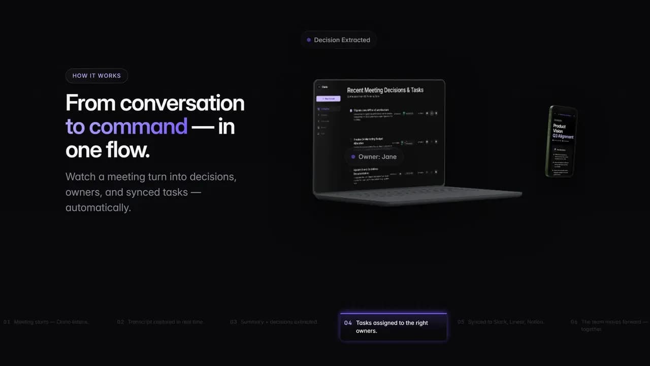
The page then plays the sequence out. A laptop and a phone hold still while labels arrive over them in order, from the moment audio is captured through to a ticket opened in Linear and a message pushed to Slack.
Scrolling drives it, so the visitor sets the pace and cannot skip a step. The product's whole claim is that one conversation turns into several pieces of work, and this is the only part of the site that shows that rather than asserting it.
The Comparison Section
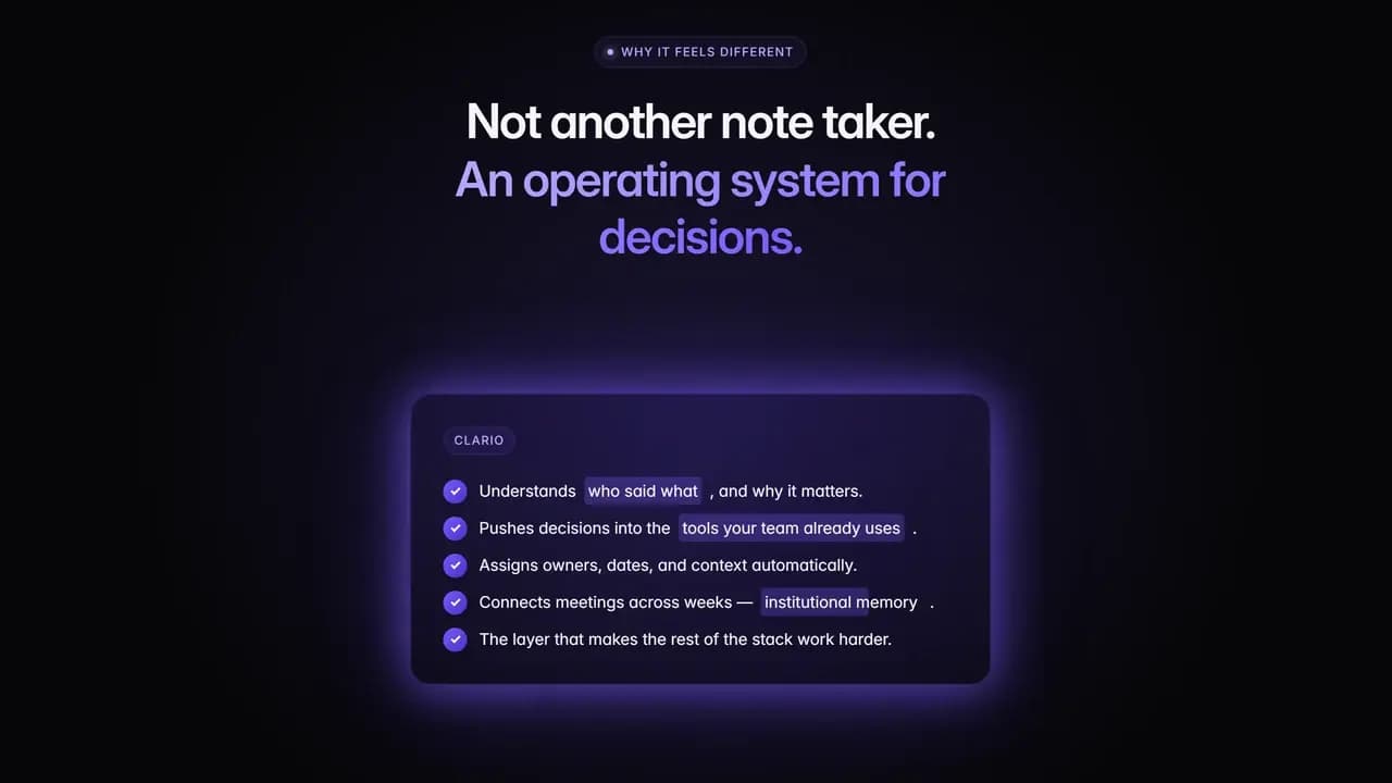
One section puts everyone else against Clario in two columns. The left is what a meeting recorder does and then stops at, the right is what the invented product claims instead.
A comparison needs an opponent, and the opponent here is a category rather than a named competitor. We wrote both columns, which is worth saying plainly, because it is the easiest section on any product page to win.
Five Entrances
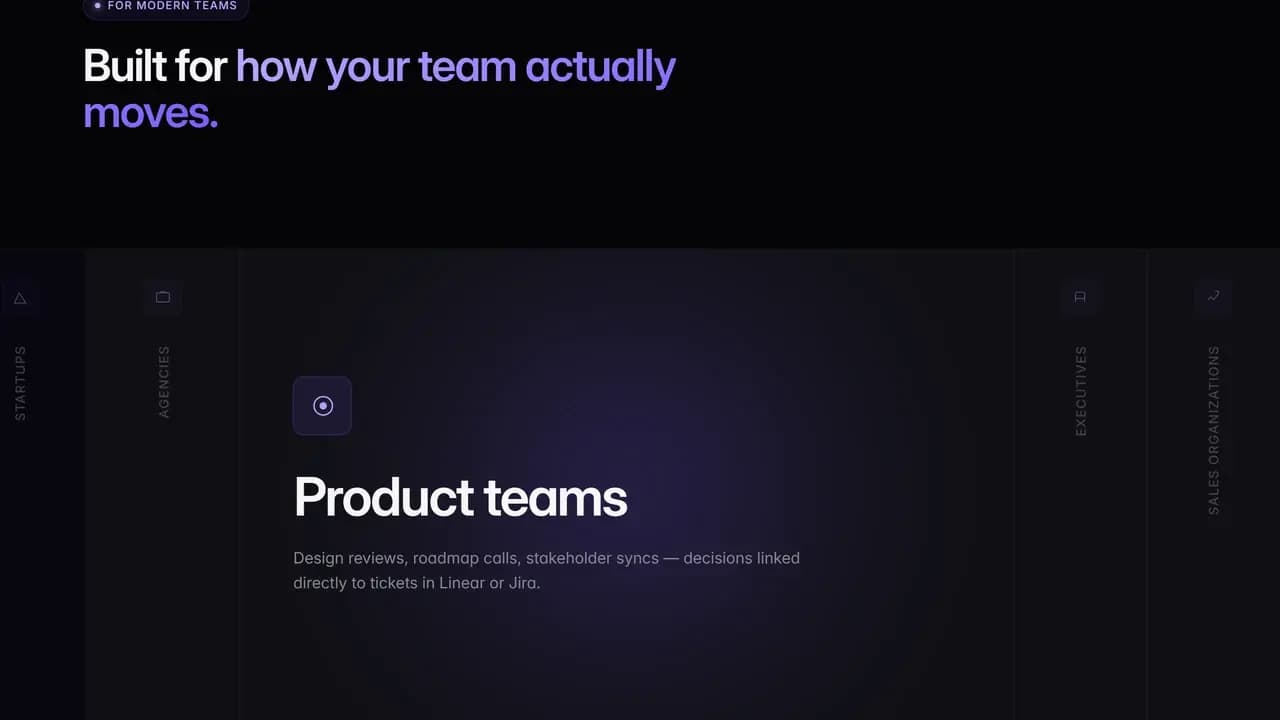
The audience section cuts the same product five ways, for startups, agencies, product teams, executives and sales teams, each with one line about what that particular reader is worried about.
It is a rail you move along rather than five cards set side by side, so the page keeps one height and a reader picks their own way in.
No Framework
The site is static. Hand written HTML, CSS and JavaScript, a single script file, no framework and no build step, with GSAP and its ScrollTrigger plugin doing the scroll work.
That is deliberately not the stack we reach for on client builds. One marketing page that has to feel exact is the case where a framework buys very little and costs more shipped code than it saves.
The Closing Proof Block
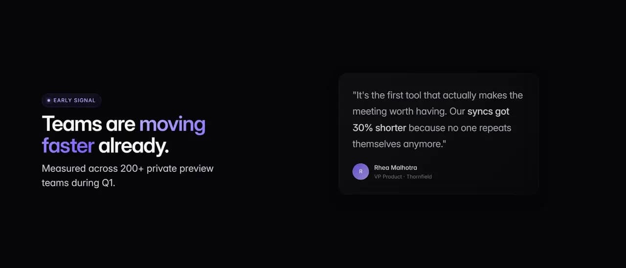
A launch page closes on proof, so this one does too: a results wall, a research wall, and testimonials set as three bands of decreasing weight, each one narrower than the last so the eye finishes at the call to action rather than in the middle of a grid.
The content in it is placeholder for a product that does not exist, and the demo's own footer calls itself a portfolio concept. What the section is doing here is holding the shape, which is the part that transfers to a page with real proof in it.
Keep exploring
Next project: Yum StreetWant something like this for your business?
Tell us what you're trying to grow, and we'll reply with a straight answer on whether and how we can help.