Auto Detailing
Visit the live site (opens in new tab)A car preservation demo built as a single document, with a type system doing most of the work.
Capabilities used
- Brand Strategy & Identity
- Creative Design & Content Production
- Web Development & Marketing Funnels
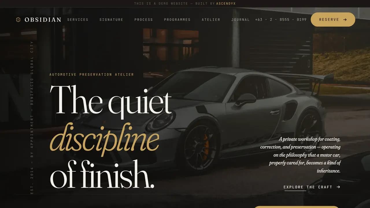
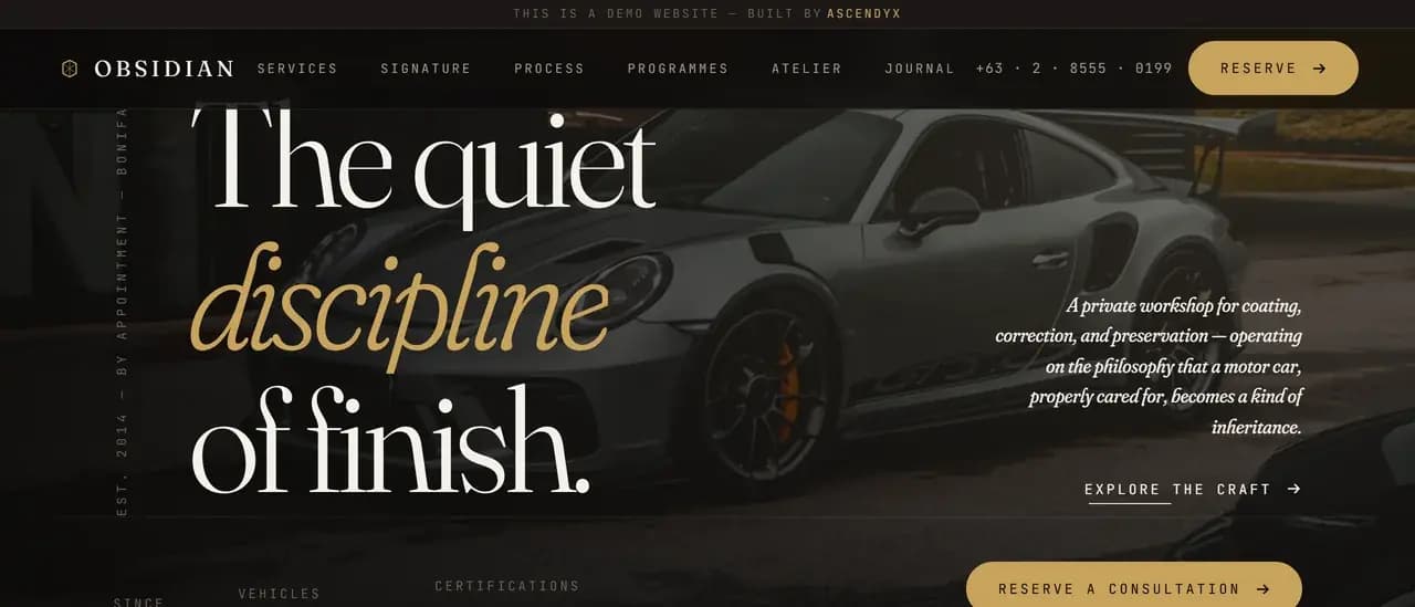
The Headline as Brief
Obsidian is an automotive preservation atelier that nobody can visit. We named it, wrote it and built it, and the top level heading on the page is the line everything underneath is there to earn: the quiet discipline of finish.
Every section after it keeps the same register. Services are disciplines, steps are movements, packages are programmes, the gallery is an archive and the shop is an atelier. A detailing business, written as a conservation studio.
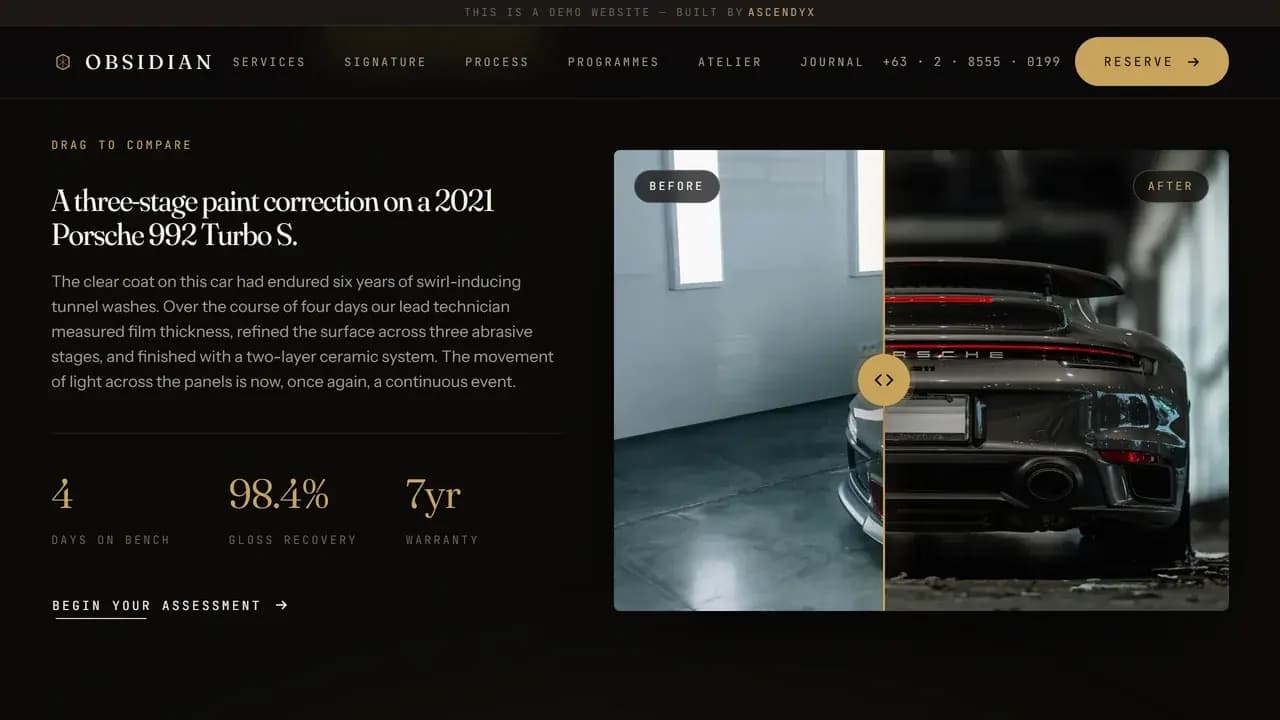
The Drag Handle
One part of the page asks you to do something. A correction is shown as two states of the same panel with a handle between them, and you pull it across to see what changed.
It is the right thing to make interactive. Correction is the claim a detailer has the hardest time proving in words, so the page hands it over and lets you check for yourself. The handle answers the arrow keys as well as the pointer.
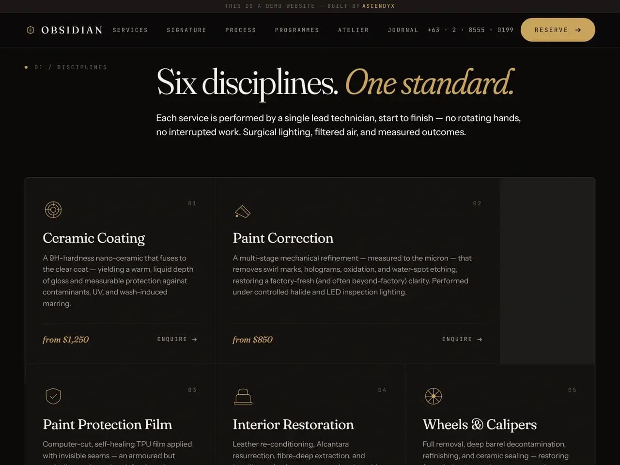
The Type System
Fraunces sets the display type, a high contrast serif with a real italic. Instrument Sans carries everything meant to be read. JetBrains Mono appears only on labels, section numbers and the small line running up the side of the hero.
That is a type system rather than a pairing. Each face has one job and never borrows another, so a reader can tell what a piece of text is for before reading a word of it.
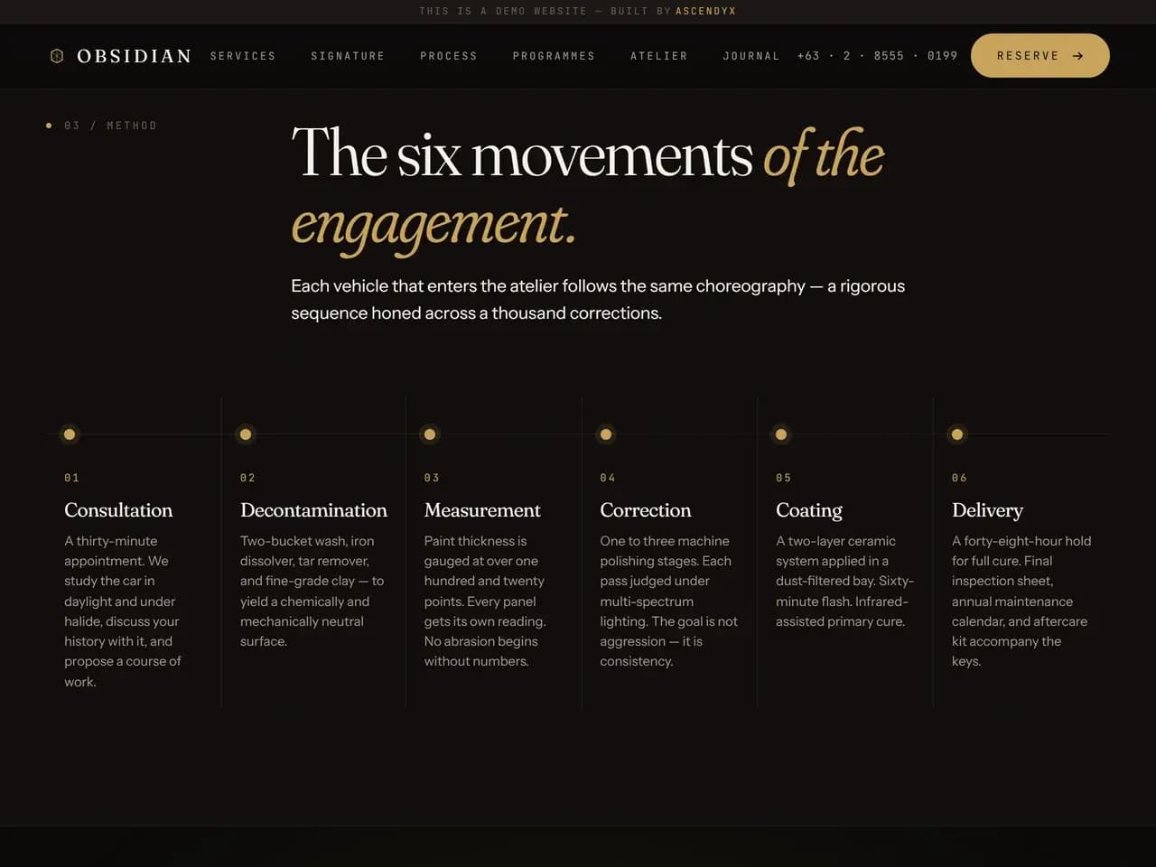
Process as Movements
The process is laid out as six of them: consultation, decontamination, measurement, correction, coating and delivery. Each is numbered and each gets a couple of lines of its own.
As a booking funnel this would be a list of stages to get through. As movements it becomes a sequence whose order matters, which is nearer to how the work is actually done.
Programmes as a Year
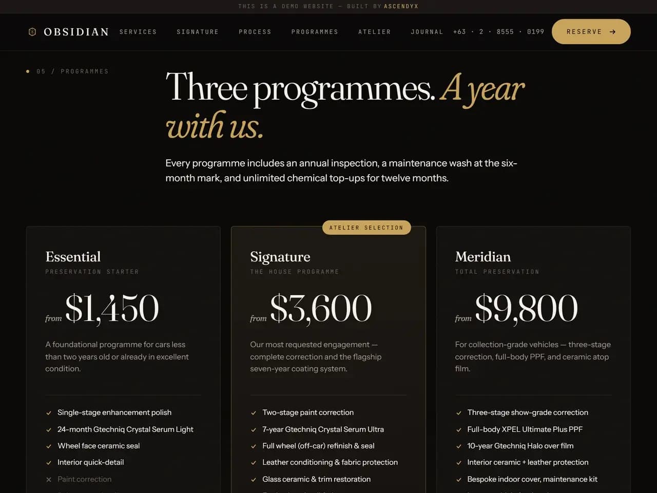
Three programmes carry the commercial idea, named Essential, Signature and Meridian. Each is a year with the shop rather than a single appointment, with an inspection and a maintenance visit built into it.
The naming does most of that work. A programme is something you enrol in and a wash is something you buy once, and the page never once uses the second word.
The Archive
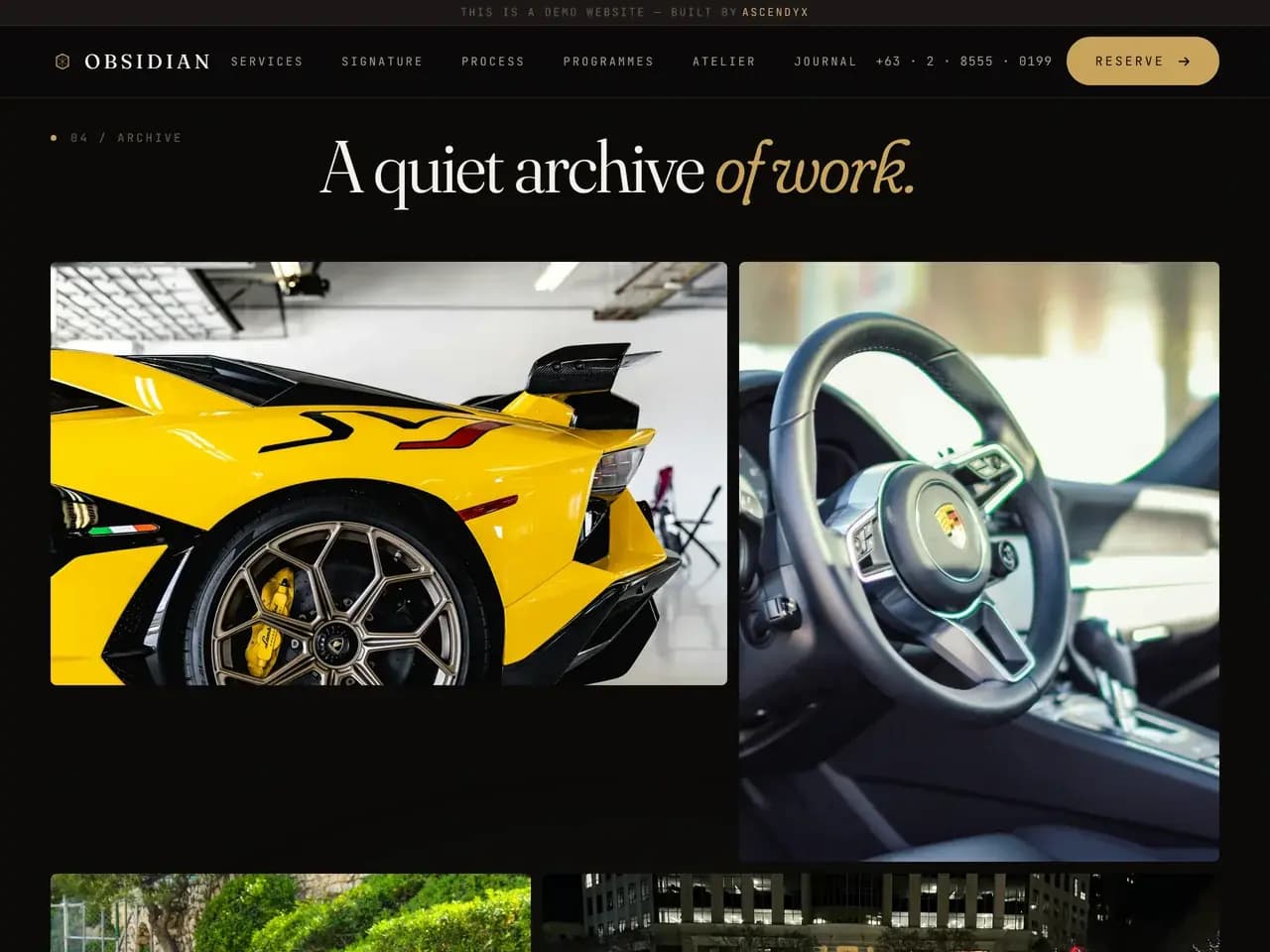
The work is presented as a record rather than a portfolio. Every entry names the car, its colour and the job it came in for, set in the same mono face as the section numbers.
The photographs the site hosts we chose and edited ourselves. Two more are pulled live from a free stock library and used exactly as they arrive.
Near Black and Brass
The ground is almost black, and warm rather than blue. Against it sits a single burnished brass, used for the accent rules, the active states and nothing else at all.
Corners are held at about two pixels everywhere, so almost nothing on the page is rounded. One colour and a hard corner are what make a dark page feel built rather than decorated.
The Largest Single File
The whole site is one document. A single style block, a single script, no framework and no build step, and the only thing it asks another server for is its typefaces.
It is the largest of the single file demos in this portfolio and it carries more photography than any of them, so the document is doing the most work of the set. The brand and the copy are ours, drafted with AI and then rewritten by hand. The document was built the same way and tuned by hand afterwards.
An Unbroken Register
Eight sections, and the register holds through all of them. The questions are answered candidly rather than helpfully. The booking form is a private consultation. The archive is quiet.
Holding a voice is easy in a headline and hard across the hundreds of small strings underneath it. Nothing else in this portfolio commits to one this far.
Keep exploring
Next project: Live DashboardWant something like this for your business?
Tell us what you're trying to grow, and we'll reply with a straight answer on whether and how we can help.