A skincare brand built from the jar outwards: the name, the packaging, the pictures and the shop that sells them.
Capabilities used
- Brand Strategy & Identity
- Creative Design & Content Production
- Web Development & Marketing Funnels
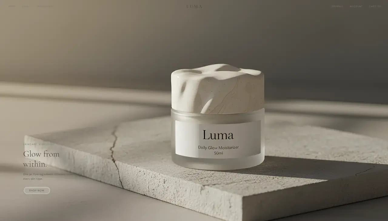
An Invented Label
There is no jar, no formula and no customer. Building the brand from the container outwards is what made the rest of it decidable: the lid colours set the palette, and the palette set the shop.
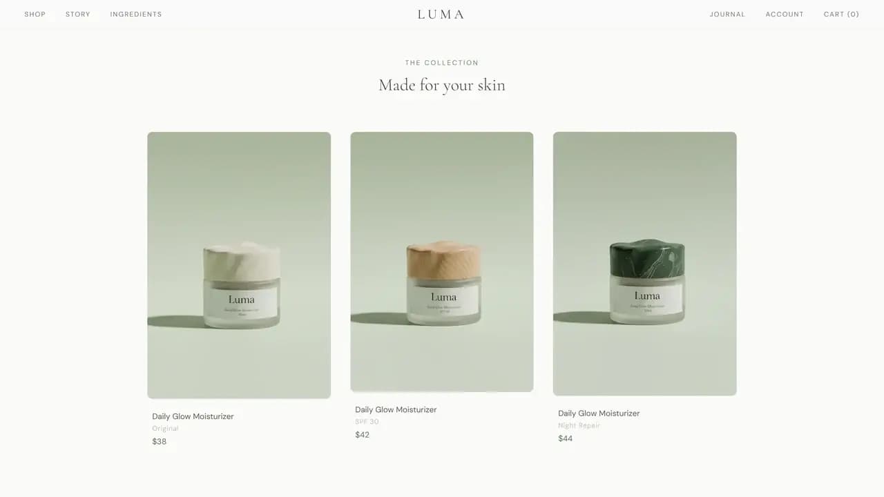
One Product, Three Jars
The shop sells one moisturizer in three versions: the plain one, one with sun protection and one for overnight. Each gets its own lid colour, its own price and its own card in a single row.
Designing a range of one is easy. Selling it is not, so the variants carry the work a longer catalogue would normally do and give the page something to compare.
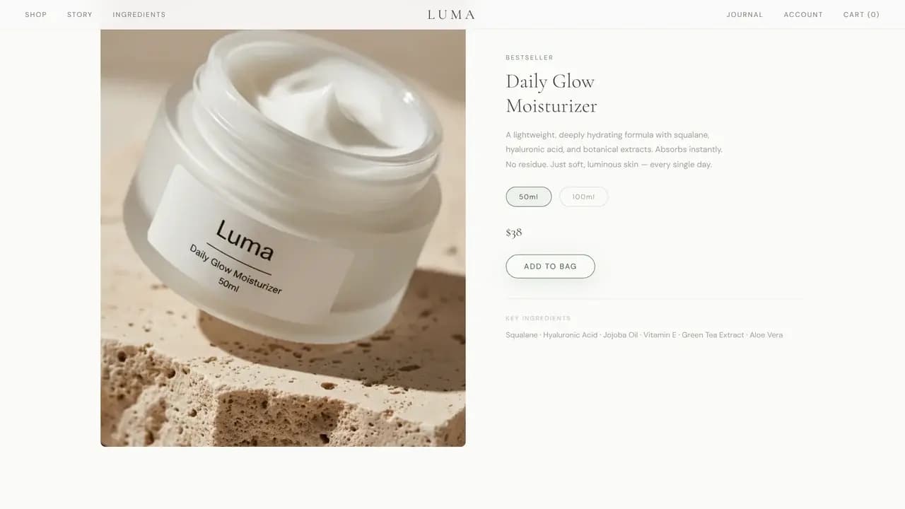
The Product Page
The grid links into a full product page: a large photograph, the ingredient list, a size choice, an add to bag control, and the copy that answers what a label has no room for.
Concept sites usually stop at the grid. The page after it is where a product brand either holds a visitor or loses one, so that page was the reason for building a shop at all.
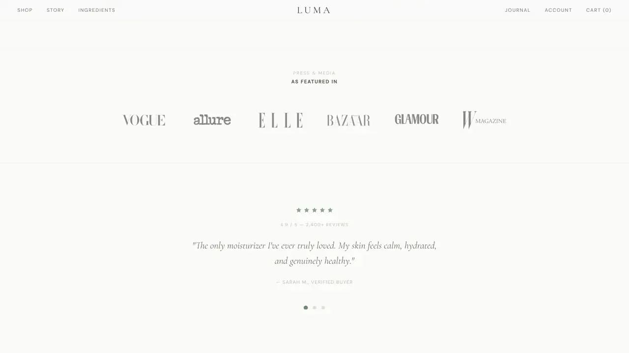
The Social Proof Row
A skincare page earns its trust in a strip: mastheads, a star rating, a review count, a quoted buyer. The row is set quiet and wide so it reads as reassurance on the way past rather than as a claim demanding attention.
The content in it is placeholder for a brand that does not exist. What the row is doing here is holding that position on the page, which is the part a real label would fill in.
The Unboxing Band
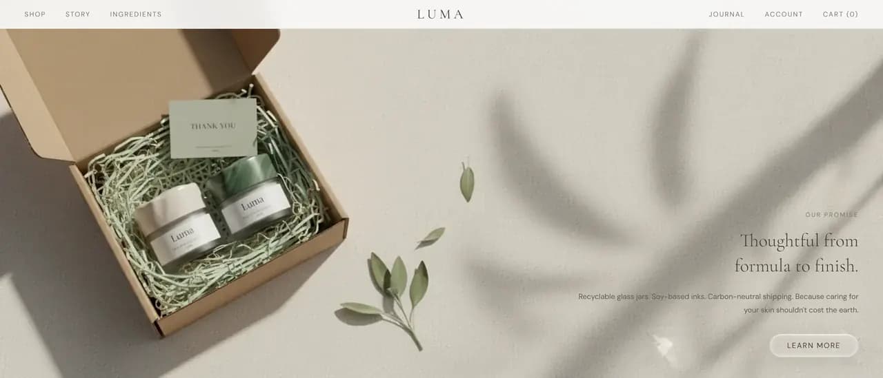
The story band is an unboxing: a mailer, a thank you card, two jars in shredded paper, and a short claim about recyclable glass and how the parcel travels. The copy sits beside the picture instead of under it.
A skincare buyer handles the box before they handle the product, so the demo gives the box a page. The claims printed in it belong to the invented brand and are not ours.
The Journal
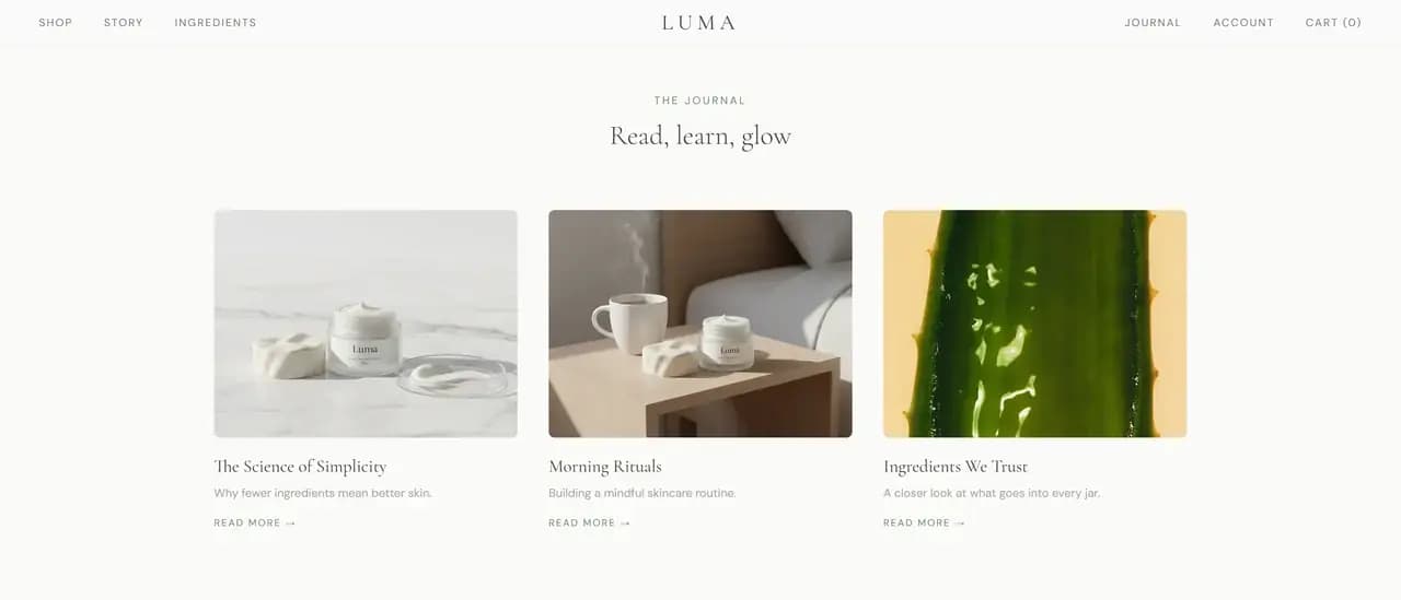
Three journal cards close the page: one on short ingredient lists, one on morning routines, one on what goes into the jar. Each carries a title, a line of summary and a link that goes nowhere yet.
Without it the site is a shop and nothing else, with no reason to return between orders. The journal is the cheapest part of the build and it changes what the site is for.
The Photography
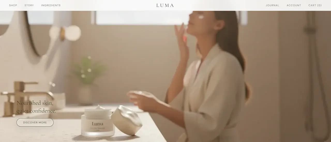
Every picture here was generated by us: the jars, the shelf shots, the unboxing, the bathroom scene and the strip along the bottom. No product exists, so there was nothing to point a camera at, and the imagery had to be made the same way the brand was.
That is the part worth noticing. The photography carries the whole feel of a skincare brand, and it was art directed rather than shot: the stone, the light, the crop and the palette were decisions before they were pictures.
A Front End Only
Every control that would take money answers the same way. The cart, the buy controls, the footer shop links and the newsletter all reply with a short coming soon message, and no address is stored anywhere.
It is a front end and nothing else: static HTML, CSS and JavaScript, one stylesheet, one script, Cormorant Garamond and DM Sans from Google Fonts, no framework and no build step. What sits behind a real shop is a catalogue, stock, payment, tax, shipping and somewhere for an order to land, and none of that is here.
Keep exploring
Next project: RestaurantWant something like this for your business?
Tell us what you're trying to grow, and we'll reply with a straight answer on whether and how we can help.